Use Quick Charts
Quick Chart is a part of Data Analytics![]() a process for inspecting data to spot trends and progress, used in conjunction with Quick Charts in Aspen. Charts provide an
organized way to visually represent data.
a process for inspecting data to spot trends and progress, used in conjunction with Quick Charts in Aspen. Charts provide an
organized way to visually represent data.
The Quick Chart feature enables you to create bar, line, and pie charts from any standard list page. These charts can be saved for future use.
|
Note: Use Quick Charts as way to collect statistics quickly. For example, say you want a count of students by grade and gender. Just select Bar Chart and under the Quick Chart menu, enter Grade and Gender and click OK. Beneath the chart are the counts. |
Users with privileges to manage school and/or
There are three chart types:
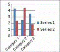
Bar |
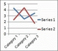
Line |
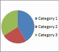
Pie |
Select one of the following topics to learn more about Quick Charts![]() customizable visual respresentations of Data Analytics:
customizable visual respresentations of Data Analytics: