Create a Quick Chart
On all standard list pages, click the Quick
Chart menu ![]() to access the following options:
to access the following options:
- Create Quick Chart: Brings up the Quick Chart Wizard, which lets you customize many different areas of the resulting chart.
- Bar Chart: Brings up a streamlined Quick Chart screen, which requests only minimal information required to create a bar chart.
- Line Chart: Brings up a streamlined Quick Chart screen, which requests only minimal information required to create a line chart.
- Pie Chart: Brings up a streamlined Quick Chart screen, which requests only minimal information required to create a pie chart.
To create a Quick Chart:
In any standard list view, click ![]() and
select Create Quick Chart to open
the Quick Chart wizard, or select Quick
Chart from the Reports
menu.
and
select Create Quick Chart to open
the Quick Chart wizard, or select Quick
Chart from the Reports
menu.
The Create Quick Chart wizard appears.
The Create Quick Chart wizard has five steps:
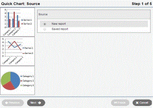
Step 1: Source
- Click one of the following:
- New report: Select this option if you want to create a Quick Chart from scratch.
- Saved report: Select this option if you want to use a Quick Chart you previously created.
- Do one of the following:
- If you selected New report, click Next.
- If you selected Saved report, a table of saved Quick Charts appears in the pop-up. Select the one you want to edit or view. Then click Next to continue editing, or Finish to show the chart.
Step 2: Report Type
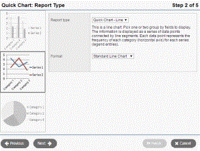
- Click the Report type drop-down to select one of the following:
- Quick Chart—Bar
- Quick Chart—Line
- Quick Chart—Pie
- Click the Format drop-down to select the format for the chart: Standard or Enhanced (3-D).
|
Note:
Each Quick Chart format is a standard report which can be seen in the
|
- If this is a new report, click Next. If you are editing a saved report, you can click Next to continue editing, or Finish to show the chart.
Step 3: Field Selection
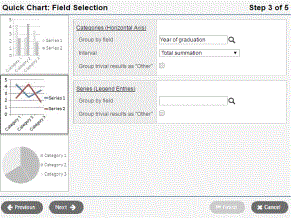
- In the Categories
(Horizontal Axis) box, click
 at
Group by field and make a
selection. You can choose from the tables and fields that are related
to the records in your current list. The Categories
(Horizontal Axis) box, sometimes called the independent variable,
sets the data you want to measure. If you choose a Numeric,
Date, or Time field,
additional options let you further organize the data on the chart.
at
Group by field and make a
selection. You can choose from the tables and fields that are related
to the records in your current list. The Categories
(Horizontal Axis) box, sometimes called the independent variable,
sets the data you want to measure. If you choose a Numeric,
Date, or Time field,
additional options let you further organize the data on the chart. -
Selection Type (example)
Additional Fields
Description
Numeric (YOG)
Interval
The Interval drop-down for numeric has the following options:
- Chart each value separately: Each numeric value gets its own data point.
- Interval group: The
Interval field
groups the results according to the number entered in
the Interval group size
field. For example, if you want the group
Year of Graduation to display in the chart in pairs,
you would enter 2
in
this field. - Interval group summations
- Total summation: Sums the values of the Group by field.
Interval group size
The Interval group size appears if you select Interval group or Interval group summations at the Interval field. The value in this field sets the number of data points that get combined into a single category.
Group insignificant data
Select this checkbox if you want to group all data points of less than a certain percent. For example, if you are only concerned with viewing the several most common
Note: You are only able to use
this option in the Categories or
Series, but not both.Less than n%
Sets the percent under which data is grouped in the Other category.
Date (Date of Birth)
Interval
The Interval drop-down for a date type field has the following options:
- Chart each date separately
- By day of week
- By day of week and month
- By day of week and year
- By week
- By week and year
- By month
- By month and year
- By school year
Time (Time)
Interval
The Interval drop-down for a time type field has the following options:
- Chart each time separately
- By minute
- By minute, hour and date
- By hour
- By hour and day
- For bar and line
charts, a Series (Legend Entries)
box is available. Click at
the Group by field
and make a selection. Additional options are available, as described
above for Categories selection. Series groups appear in a legend
to the right of the chart and provide a color-coded guide to data
shown in the chart.
|
Note: Bar and line charts do not require both a category and series to be selected. Charts that exclude a category will not have x-axis labels. Charts that exclude a series will not include a legend. |
- If
the list of data being charted contains trivial cases which should
be excluded from the chart, the option Group
trivial results as "Other" is provided. Select this checkbox if you want to group all data points of less than a certain
percent together into a single point called Other.
For example, if you are only concerned with viewing the most common
|
Note: You are only able to use this option in the Categories or Series, not both. |
- You can click Next to continue the wizard and set chart options, or Finish to create the chart. New charts use the default format options if you click Finish at any point before the final step in the wizard.
Step 4: Format Options
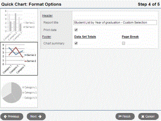
- In the Report title field, enter a title for your report. The title appears above the chart.
- Do any of the following:
- If you want the date the report was created to appear on the report, select Print date.
- If you want a table of data summarizing the chart to appear below the chart, select Data Set Totals.
- If you want the table data summarizing the chart to appear on its own page, select Page Break.
- Click Next to continue editing, or Finish to show the chart.
Step 5: Save Options
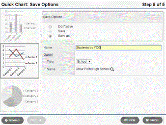
- In the Save Options section, click one of the following:
- Don’t save: The report appears in your job queue, but if you want to run the chart again, you must recreate it.
- Save: This option is only available if the chart has already been saved. This option overwrites the previous version.
- Save as: This option saves the chart with the name you type in the Name field.
- If you selected Save as in the Save Options section, type what you want to name the chart in the Name field.
- Under
Owner, select
- If
you select the type User in the Type drop-down, click
at the Name field to select a user.
- Click Finish.
The chart appears in a pop-up window.
|
Notes:
|